

Pairing a serif with a sans serif sounds simple until you actually open your design tool and stare at 1,400 Google Fonts. Most articles stop at vague advice like create contrast or look for variation. That is not enough when you are shipping a real website with real conversion goals.
This guide is different. We at Joxa Design build websites every week, and below you will find 7 serif and sans serif pairings we actually use in production, with the exact weights, sizes, line heights, and contrast notes that make them work on screens.
Why Pair a Serif With a Sans Serif in the First Place?
The combination works because it solves three concrete web design problems at once:
- Hierarchy: The visual difference between the two styles instantly signals what is a heading and what is body text, even before the user reads a word.
- Personality: Serifs carry tradition, editorial authority, or warmth. Sans serifs feel modern, neutral, and efficient. Combining them lets a brand feel both trustworthy and current.
- Readability at scale: A sans serif handles UI elements, captions, and small sizes better. A serif gives long-form content rhythm and reduces fatigue when used for paragraphs above 16px.
The classic rule says: serif for headings, sans serif for body. That rule is outdated. On modern screens with high pixel density, the reverse often performs better. We will show both directions below.
The 4 Rules That Actually Matter for Web Pairing
- Contrast in shape, not just style. If your serif has tall, narrow letterforms, pair it with a sans serif that is wider and rounder. Two condensed fonts together feel cramped.
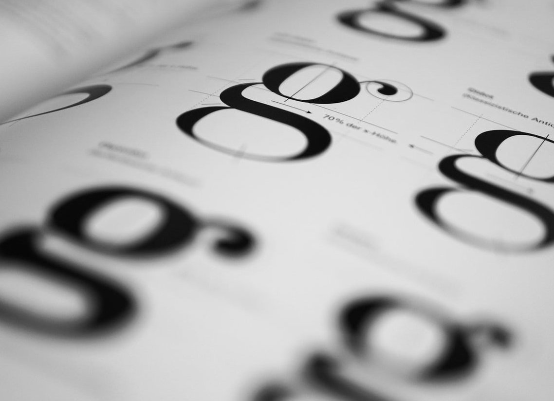
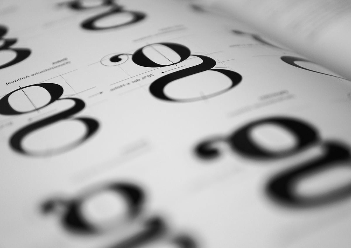
- Match the x-height. When the lowercase letters are roughly the same height, the two fonts feel like they belong to the same system. Mismatched x-heights look like a mistake.
- Limit weights to 2 or 3 per font. A regular and a bold for body, plus one display weight for the heading font. More than that and your design system bloats.
- Test at 14px, 16px, and 32px minimum. A pairing that looks beautiful at 48px in Figma can fall apart in a mobile menu at 14px.
7 Serif and Sans Serif Pairings That Work in Production
1. Playfair Display + Inter
Best for: Editorial blogs, agency sites, premium SaaS landing pages.
Playfair has a strong vertical contrast and dramatic serifs that make headlines feel like a magazine cover. Inter is the most neutral sans serif of the last decade and stays out of the way for UI and body text.
| Element | Font | Size / Weight |
|---|---|---|
| H1 | Playfair Display | 56px / 700 |
| H2 | Playfair Display | 36px / 600 |
| Body | Inter | 17px / 400, line-height 1.65 |
| UI / buttons | Inter | 15px / 500 |
2. Source Serif + Source Sans
Best for: Documentation sites, knowledge bases, long-form reading platforms.
Both come from the same designer at Adobe, so the x-heights and proportions are intentionally aligned. The result is a system that feels engineered rather than glued together. This is the safest pick if you are nervous about pairing.
3. Fraunces + Manrope
Best for: Modern brand sites, design portfolios, fashion and lifestyle.
Fraunces is a variable serif with adjustable softness and contrast, which means you can tune it from quirky to elegant in one CSS variable. Manrope balances it with geometric, slightly rounded letterforms.
Use Fraunces for headings at weight 500 with optical size 144. The display optical size is what makes it look high-end at large sizes.
4. Lora + Work Sans
Best for: Personal blogs, coaching sites, small business websites.
Lora was designed for screens from day one. Its calligraphic roots add warmth without being decorative. Work Sans complements it with a friendly, slightly humanist tone. The pairing reads as approachable rather than corporate.
5. DM Serif Display + DM Sans
Best for: Startups, marketing sites that need quick visual impact.
DM Serif Display has very high contrast strokes that grab attention at large sizes but become unreadable below 24px. Use it only for H1 and hero text. DM Sans handles everything else, including H2 if you want a calmer feel for sub-sections.
6. EB Garamond + IBM Plex Sans
Best for: Long-form journalism, academic sites, B2B with editorial ambition.
This is the inverse classic: serif for body, sans serif for headings. EB Garamond at 18px with a line height of 1.7 is one of the best reading experiences you can build on the web. IBM Plex Sans gives the headings a technical, almost engineering feel that contrasts well with the warm body text.
7. Newsreader + Geist
Best for: AI products, modern dev tools, content-heavy product sites.
Newsreader is built specifically for on-screen reading at body sizes. Geist, released by Vercel, is one of the cleanest sans serifs available right now. The pairing feels current without being trendy. We use this combo on several Joxa client projects launched this year.
How to Decide the Direction: Serif Heading or Serif Body?
| Goal | Recommended direction |
|---|---|
| Marketing site, short copy, strong brand statement | Serif heading + sans serif body |
| Editorial, blog, articles over 800 words | Sans serif heading + serif body |
| SaaS dashboard with marketing pages | Serif heading + sans serif body, sans serif only inside the app |
| E-commerce | Serif heading + sans serif body, sans serif for product cards |
Contrast Ratios and Sizes That Create Harmony
Pairing fonts is also pairing sizes. A pairing fails when the heading does not feel meaningfully larger than the body. Use a type scale ratio between 1.25 and 1.333 for content sites, and 1.5 for marketing pages with bold hero sections.
- Body: 16px to 18px. Never below 15px on desktop.
- H3: body size multiplied by 1.25 (about 20 to 22px)
- H2: body size multiplied by 1.563 (about 25 to 28px)
- H1: body size multiplied by 1.953 to 2.5 (about 32 to 45px on desktop)
- Hero display: 56 to 80px on desktop, scaling down to 36px on mobile
For weight contrast, aim for at least 300 units of difference between heading and body weight. A 700 heading next to a 400 body always reads cleanly. A 600 heading next to a 500 body looks indecisive.
Common Mistakes to Avoid
- Using two display fonts together. Display serifs and display sans serifs both demand attention and end up fighting.
- Forgetting fallback fonts in your CSS stack. If your font fails to load, the layout shift can break your hierarchy.
- Loading too many weights. Each weight is an extra HTTP request. Keep total font weight under 200KB for performance.
- Ignoring the optical size axis on variable fonts. Modern fonts like Fraunces and Source Serif have optical sizes designed for display vs body. Use them.
- Testing only on a 27 inch monitor. Always check pairings on a 13 inch laptop and a phone before shipping.
Quick Workflow for Your Next Project
- Define the brand tone in 3 words (for example: trustworthy, modern, warm).
- Pick one font that carries that tone the strongest. This is your character font.
- Pick a neutral counterpart from the opposite category (serif or sans serif).
- Build a type scale with the ratio that matches your content density.
- Test at the 3 critical sizes: 14px, 16px, and your hero size.
- Check the pairing with real content, not lorem ipsum. Real headings reveal real problems.
FAQ
Can I use two serifs together on a website?
Yes, but only if the two serifs are visually different enough. A high-contrast modern serif like Bodoni paired with a slab serif like Roboto Slab can work. Two transitional serifs like Georgia and Lora will look like a mistake.
Are Google Fonts good enough for professional sites?
Absolutely. All 7 pairings in this article are available on Google Fonts or as free open source files. The quality of free fonts has caught up with paid foundries for most use cases.
How many fonts should a website use in total?
Two is the sweet spot. Three is acceptable if one is a monospace for code or numbers. More than three almost always signals a design without a clear system.
Should I match my logo font in the website body text?
Usually no. Logo fonts are designed for one fixed size and one fixed word. Use a related but distinct font for the website system, and let the logo stand alone.
What is the easiest pairing for someone with no design background?
Source Serif paired with Source Sans. They are designed to work together, the proportions match, and you cannot really break it. Start there and refine later.
Need help applying these principles to your own website? The Joxa Design team builds custom typography systems for every site we ship. Get in touch to talk about your project.