by Jon Bowman | Sep 23, 2026 | Uncategorized
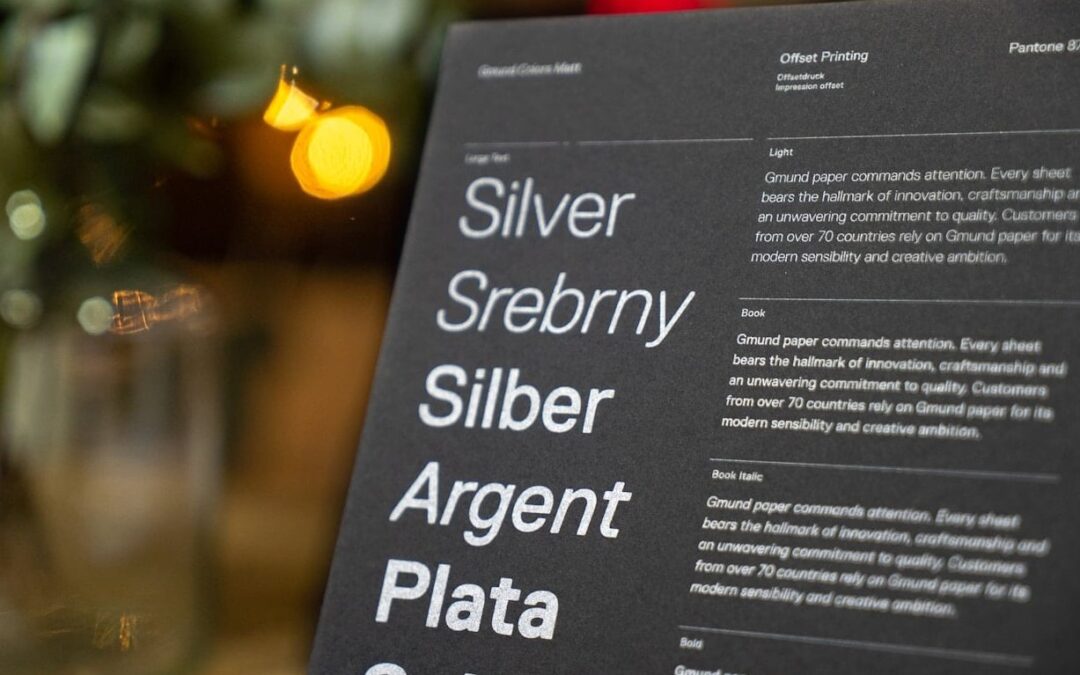
A fluid type scale built with CSS clamp() lets your typography grow smoothly between a small screen and a large screen, without a single media query. One line per size, no breakpoint jumps, no half-broken headings at 900px. Most tutorials stop at “here is a...

by Jon Bowman | Aug 29, 2026 | Uncategorized
Choosing the right fonts for a bakery brand is one of the most underrated decisions in food branding. Long before a customer tastes your sourdough or bites into a croissant, they read your name on a window, a bag, or a menu. The typeface does the first job: it...
by Jon Bowman | Jul 29, 2026 | Uncategorized
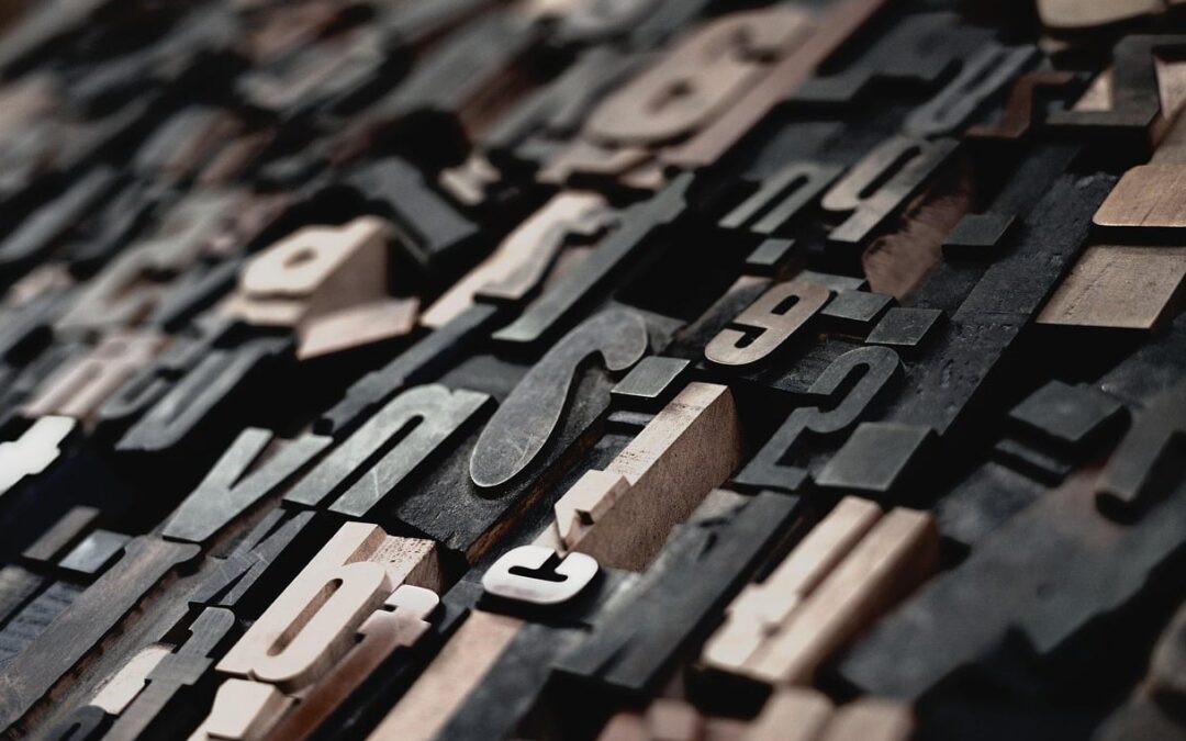
Kerning vs Tracking vs Leading: The Real Difference Explained (With Visual Examples) If you’ve ever opened Figma, Photoshop, or InDesign and wondered why your text looks off but you can’t pinpoint why, you’re not alone. Most self-taught designers mix...
by Jon Bowman | Jun 1, 2026 | Uncategorized
Pairing a serif with a sans serif sounds simple until you actually open your design tool and stare at 1,400 Google Fonts. Most articles stop at vague advice like create contrast or look for variation. That is not enough when you are shipping a real website with real...

by Jon Bowman | May 7, 2026 | Uncategorized
What Is Bauhaus Typography Style? The Bauhaus typography style is one of the most influential design movements of the 20th century, and its fingerprints are still visible across branding, web design, and digital interfaces in 2026. Born out of the Bauhaus school in...